If you would like to submit photography or photo restoration tips to this blog, please email me at KevinRetouch@gmail.com.

We will gladly provide a link to your website or blog along with your contribution.

Sunday, September 1, 2013

The Cost of Photo Restoration . . .


By Kevin Winkler


Contrary to popular belief, digital photo restoration and repair is not about computer magic; it's about art, experience, knowledge, hard work, and, dare I say, love.

Working from an original photo or print, we recreate your photo in digital format (or use your digital file) and then transform the portrait back to its original state . . . or as close as it can possibly get to its original state.

Or, if you prefer, we can manipulate your image until it's something entirely different.

Either way, we use state-of-the-art computer software as our tools - our "oil, brush, and canvas" - to perform the task of restoring, enhancing, manipulating, or repairing your cherished photo.

In short, there is no computer magic involved, just artistry, using a computer as the artist's tools.


Is the company you are interested in undercutting everyone else?


True restoration artists value their education, experience, skills and time . . . and charge a fee for their services accordingly.

Chances are, if a "company" is dramatically undercutting everyone else, alarm bells should be sounding.

Perhaps they are charging less than their competitors because they are failing as a business and are desperate to get the work. If that's the case, ask yourself this . . .


1) Are they failing because they lack the skills that others possess?

2) Will they be around long enough to finish the job?

3) Are they going to spend as much time on my image as necessary to get the job done right? Or are they going to take short-cuts, resulting in inferior results?

4) Could I get better results elsewhere by paying a little more?


Another possibility for the undercutting is that they are outsourcing the work . . . and your precious portrait . . . to countries where labor is cheap.

That's ok, I guess, if you are unconcerned about keeping your dollars in your own country. And if you like the restoration style in that part of the world, which is often over-airbrushed and soft, with exaggerated colors and smoothed over skin, so much so it looks like porcelain.

Also, if the work is outsources to others, contact with the company for things like quotes and minimal adjustments to the restored photo will most likely to be slower, given the third party element of the transaction and the various time zone involved.

If you are concerned about these issues, don't be afraid to ask!

Sticking with local artists in your country, who do not outsource the work to other countries, will not only boost your economy, it will most likely insure better craftsmanship and faster turnaround times.

And don't be afraid to pay a little more. You are not only paying to restore a photo; you are also paying to restore a memory. Chances are, it will be worth the extra money.


Tuesday, August 13, 2013

10 Sites to Capture with Your Point and Shoot Camera

By Nicole Tripp


Some of the best vacations are the ones close to home. Sure, an escape to the Ishinca mountain peak of Peru would be amazing. However, the good ol’ United States has several great destinations that will wow your senses without needing a TSA pat down.

While New York never sleeps, Disney is the Happiest Place on Earth and D.C. has enough history and science museums to increase your IQ by 7 percent, there are many places to visit that are a little less popular. They are located all over the country, so it's easy to find one close to you. Pack a lunch, grab your point and shoot camera and enjoy a fun and unique day trip that will be just as impressive as toasting locals in Morocco with unpasteurized camel's milk. Here are 10 lesser-known sites to check out and explore.


10. Cadillac Ranch – Amarillo, TX
Located on a cattle ranch in the middle of Texas, the Cadillac Ranch is a commemorative art piece first created in 1974. Each Cadillac, made between 1949 and 1963, was planted nose first into the ground to show the evolution of the cars' defining tailfins. Although on private property, the Cadillac Ranch is open to the public. You are also welcome to bring along your spray paint and leave your colorful mark. It won't stay long, because so many people come through to see the Cadillac Ranch each day. This means you will have to make this a traditional stop on your way through Amarillo, Texas. Don’t forget to snap a pic with your digital camera so you can see how the artwork changes each time you stop.
 
9. The Start of the Mississippi – Bemidji, Minnesota
Mark Twain used Tom Sawyer and Huckleberry Finn to enshrine the Mississippi River as a mesmerizing U.S. tourist staple, making it synonymous with steamboats and river rafting. Most people meet up with the Mississippi River in the middle, in the states of Mississippi and Missouri. However, the start of the Mississippi is in the little town of Bemidji, Minnesota. Not only is the river crystal clear here, but Bemidji is also a great place to learn about Paul Bunyan and his blue ox, Babe. Both have a commemorative statue that has been on display in Bemidji since 1937. Paul Bunyan stands over 18 feet high, while Babe easily reaches his shoulder. It may take a moment to play with different angles, but you should be able to snap a pic of your kids with both statues in one shot.
 
8. Mystery Castle – Phoenix, AZ
Knowing he only had a short time to live, Boyce Luther Gulley built the Mystery Castle in 1930 for his little girl. The Mystery Castle is made from recycled materials Gulley found in the town dump. Stone, automobile parts, rail tracks and telephone poles are held together with a mortar rumored to be made from cement, calcium and goat milk. The Castle has 18 bedrooms, 13 fireplaces, a chapel, a cantina and a dungeon. Plumbing and electricity weren't added until 1992. Gulley eventually died from tuberculosis in 1945. His daughter, Mary Lou, turned the Mystery Castle into a museum and lived there until her death in 2010. The Mystery Castle is still open for public tours and photography is allowed, so don’t forget to bring along your digital camera.
 
7. Devil's Gulch – Garretson, South Dakota
Jesse James is one of the most romanticized villain in U.S. history. He was notorious for getting out of tough situations, and the great escape in Garretson, South Dakota, is no exception. The story is told that James was being heavily pursued by a large posse after robbing a bank in Missouri. James came to a rock chasm with a rushing river far below. With the posse bearing down, James' only choice was to jump the gorge. Without much hesitation, Jesse James reared his horse and jumped, landing unscathed on the other side and safely riding to freedom. The infamous jumping place is now known as Devil's Gulch, and a bridge has been built for visitors to easily cross the West River. The easy-to-hike trails lead to beautiful scenic spots, perfect as natural backdrops to your photos. Commemorative plaques and a visitor center will give you more details about the heart-beating escape of James all those years ago.
 
6. Museum of American Speed – Lincoln, Nebraska
This three-story museum is dedicated to everything in racing and automotive history. Founded by Speedy Bill Smith in 1992, the museum has engines, cars, toys, racing memorabilia and much more. You can see amazing, fully intact cars – from a 1886 Benz Paten Motor-Wagon and a 1932 Boothill Express, to Kasey Kahne’s #9 NASCAR Sprint Cup Car. Other collections include soap box derby cars, pedal cars, hood ornaments and every car engine imaginable. There is an admission fee in order to get in and daily tours are offered, though you are free to explore on your own, too.
 
5. Mt. Rushmore Celebrity Heads – Branson, Missouri
The Hollywood Wax Museum in Branson, Missouri, created a replica of Mount Rushmore outside its building as a way to attract potential tourists. Instead of presidents, this Rushmore dons the faces of four celebrities: John Wayne, Elvis, Marilyn Monroe and Oliver Hardy. Since the Mount is located outside, it doesn't cost anything to drive up and snap a photo. If you want to meet more celebrities, it doesn't cost much to go inside the museum and take even more impressive pictures standing next to you favorite Hollywood icon. A portion of your admissions proceeds will be donated to the local Generation Rescue chapter, a non-profit organization devoted to autism research.
 
4. Goblin Valley – Green River, Utah
Hundreds of wind carved goblins cover the valley, making it look like something from Mars rather than the desert of Utah. In fact, several sci-fi movies, including Galaxy Quest, have filmed their Martian scenes in Goblin Valley. Open year-round and with camping facilities right inside the park, Goblin Valley is a beautiful place to explore and imagine. Even young tourists enjoy playing hide-and-go-seek among the sandstone figures and exploring nooks and crannies. Wildlife is abundant in the valley, and the weather is beautiful all year long. No two goblins are the same, so be sure to pack an extra battery for your digital camera, so you can keep exploring and capturing those images without having to stop.
 
3. Atlanta's Underground – Atlanta, Georgia
Stepping into Atlanta’s Underground is like stepping back in time with much of the original marble, decorative brickwork, and gas street lamps still visible. Atlanta’s Underground City has been a popular retail and entertainment hub for over 50 years. Several of the storefronts were built following the Civil War, during the Reconstruction era. Over the years, shop keepers started moving higher up to be at the same level as Atlanta’s railroad, and the original shops were buried and streets paved over them. In the 1960s, the shops were rediscovered and were converted into an underground shopping plaza. Today you can still see much of the old, original décor from the 1800s while enjoying modern music, food and shopping.
 
2. Myles Standish Burial Ground – Duxbury, Massachusetts
The Myles Standish Burial Ground is the oldest known cemetery in the United States. One of the signers of the Mayflower Compact, Myles Standish was hired to be the military leader of the Pilgrims after they landed in Plymouth. He devoted most of his life to protecting the new colonists from rogue and dangerous Native Americans before retiring in Duxbury, Massachusetts, a colony he helped found. Standish died at the age of 72 and was buried in the Duxbury cemetery. Along with Standish, there are 130 marked gravesites in the cemetery, including the well-known pilgrims Capt. Jonathan Alden and his wife Priscilla, as well as Revolutionary War soldiers and veterans of the War of 1812.
 
1. The Fremont Troll – Seattle, Washington
The Fremont Troll was built under the Aurora Bridge in an attempt to make better use of the empty space. Encouraged by the local folklore of trolls that live under bridges and terrorize children and luminous women, the Fremont Arts Council held a national contest to find the most creative design for a troll monument. In 1990, the 18-foot monument was built using more than two tons of concrete, rebar and wire – oh, and a 1960s Volkswagen Beetle. Over the last couple of decades, shops and local entertainment have developed around the Troll, including Troll-a-ween and the performance of Shakespeare at the Troll. At one time, the Elvis time capsule was imbedded inside. There is enough room under the bridge to pull over and snap a photo or two, so don’t forget to bring along your camera.

There are hundreds more quaint places to visit and unusual sites to see all over the United States. Regardless of where your travels take you, make sure you take your digital camera along and capture the memories to relive over and over again in the years to come.


Wednesday, July 3, 2013

A Simple Exercise to Train your Photographic Eye

 by Valerie Jardin

Here is a simple exercise you can do anywhere that will help develop your photographic eye. Take your camera with just one lens and go for a walk (of course any point and shoot camera will do the trick too).

While walking down the street, at the park or even in the wilderness, make a point to stop randomly and find something to photograph within 10 or 15 feet (3 to 5 m) from where you are standing.


Better yet, if you are walking with a non photographer, ask him or her to tell you when to stop. Look up and down, look all around you and take your time to find something interesting to photograph. It can be a scene in the street happening just in front of you, an architectural detail, the manhole cover on which you are standing or an insect on a flower.

 If you are using a DSLR limit yourself to one lens but experiment with a different lens each time to make the exercise more interesting. The point is to learn to make the ordinary look extraordinary. Try different angles, a shallow depth of field, etc. Or try some magic in the digital darkroom later!

Another idea is to get children involved in this exercise. A perfect way to get them to walk and introduce them to photography at the same time. Their discoveries might surprise you! This exercise can also be helpful if you are planning to start a 365 day project.

Here are a few examples of pictures taken during this simple exercise. I like details, in architecture or in nature and I also like to shoot with a very shallow depth of field. The goal of this exercise is not to produce fine art photographs. Consider it as a photo assignment with no pressure and see what happens.

The possibilities are endless, just remember to have fun

Wednesday, June 5, 2013

Looking Perfect, One Pixel at a Time

 By PETER WAYNER

December may be more than seven months away, but that is barely enough time for purists to lose 20 pounds, grow out bad haircuts, clean up those blemishes, and get the photos to the printer in time to mail out holiday cards.


Slackers, though, can relax because a burgeoning cottage industry in photo retouching is making it easier to clean up all of those problems with a few clicks of a mouse.
Professional photographers have relied on clever hands and sophisticated software to turn a good picture into something that stands out. Now, Web sites are selling professional retouching services. For $20 to $200 or more, anyone can get a tighter stomach, smoother skin and brighter teeth — at least in an image. In addition, a wide variety of programs make it possible for the average computer user to fix basic problems.


The marketplace is not dominated by human vanity, though, and many retouching outfits specialize in solving other problems, like fixing poorly preserved historical photographs, removing dust marks or simply balancing the colors. Emy Craciunescu, the co-owner of Phojoe.com, says 50 percent of his work is age progression, a photo alteration process to show people at different times in their lives.
“We do a lot for work for police agencies, missing people, someone who’s been divorced and the mom took the kids to California,” he said. “It’s part science, part art and a little bit intuition.”

When the problems are simple, most of the free software packages delivered with digital cameras or computers offer tools that can help. Apple’s iPhoto, for instance, comes with a tool for fixing red eye. Kodak’s EasyShare package includes a tools for tweaking the brightness, the contrast and the colors.
Many problems, though, demand more dexterity, more sophisticated software and a deeper understanding of how a computer represents an image.


Removing the wrinkles from under the eyes requires outlining the area and using a blending filter that eliminates the ripples by replacing each pixel with an average of the surrounding pixel. While the averaging is done automatically, it takes a deft hand to outline the area and choose the correct amount of blending.

Many professionals turn to Adobe’s flagship product, Photoshop, and the aftermarket offering a range of plug-in enhancements. The newest version of the product, CS3, was just released and sells for around $700. The plug-ins are sold independently. Free software packages like GIMP (available at www.gimp.org) are also popular.

Boris Kobrin runs the site Touch of Glamour, with his wife, Natalya, an artist who trained in painting natural scenes on porcelain in St. Petersburg. They specialize in “glamorization,” a process that includes standard effects like cleaning up the skin or trimming a few inches from the waist, as well as less obvious effects like reshaping parts of the face. They will enlarge lips, straighten teeth, rebuild eyelashes, whiten eyes and fix the shape of eyebrows.

Mr. Kobrin offers various levels of retouching, from light to extreme. “The customer chooses it depending on the area of use: family photo, Web site presentation, pageant photogenic competition, magazine illustration” and so on.

They provide a quote for each picture that varies according to the number of people, the complexity of the background and the quality of the image. Straightening a nose and removing a blemish on a portrait would cost $45, he estimated.

Some companies are trying to automate the process. Among them is Anthropics Technology, which makes a software program called PortraitProfessional (selling for $39.95) that gives the user about 80 ways to increase the “beauty” of a subject with algorithms that automatically shift and reshape the parts of a face.


“If they’re looking a bit tubby, you can reduce their jawline,” said Andrew Berend, the chief executive of Anthropics. “You can make their lips larger and their eyes wider, which is always a way of making them more attractive.”

But with such a program, he said, “its power to subtly alter appearance also raises some interesting moral questions.” He has received e-mail messages that pointedly asked, “Who made you the gods of beauty?”

Mr. Berend says that his researchers used numerous surveys to tweak the parameters used by their algorithms, a process he calls “democratizing.” His team tested the algorithms by posting some before-and-after shots to the ranking site HotOrNot.com, and found that they could turn some pictures rated 2 out of 10 into 8 out of 10.

Retouchers who specialize in restoring damaged photographs use many of the same basic techniques and software, but apply them with a different approach.

“I try to focus on what I do best, which is bring old or damaged photos back to life,” said Kevin Winkler, who markets his work at bestphotorepair.com. “My specialty is the hand-coloring of those photos after they’ve been restored. Colorizing, or hand coloring, truly is an art in and of itself, given you must have a feel for what the colors in an old photo might have been during that particular time period.”

Mr. Winkler’s prices start at $9.99 and rise to $49.99 for detailed restoration. Other effects like hand coloring of a black-and-white photo begin at $12.99. As with most retouching, his prices cover a digital copy of the fixed image. He also subcontracts high-quality prints on canvas at prices beginning at $40.

There are limits, though, to what can be restored. Justin Langley, president of FixUpPix.com, says he was recently asked to enhance a surveillance camera picture of someone stealing a bike.

“It was a night shot, from what must have been 50 feet away,” he said. “I think he was under the impression that we would be able to take a very small image, blow it up, and press the magic button on the keyboard where it automatically enhances every little detail and brings out the faces of the bad guys, just like they do on TV shows like ‘C.S.I.’ ”

All of the restoration artists say it is crucial for users to provide as much detail as they can by scanning images at the highest possible resolution.


The restoration artists are also able to edit people in to and out of photographs. Many customers ask the services to edit former husbands or wives out of cherished family photos. One bride who came to FixUpPix.com (which charges $29.99 for any type of photo repair) was happy with her appearance only in the one picture in which her husband’s eyes were closed.

This technique can lead to ethical questions. “A boyfriend wanted to get back at an ex-girlfriend, and he wanted us to put her head on a nude body,” Mr. Craciunescu said. “We won’t do things like that.”
Reputable news organizations have strict rules forbidding photographers or editors from using such tools to alter images.

But when it comes to family matters or simple vanity, the ethical equation is different.
“Most pictures are about memories,” Mr. Berend said. “They’re to be looked at years later. When you show your kids your wedding picture, it’s nice that they’re nice. Harsh reality is not always what people want.”


Saturday, April 13, 2013

Choosing a photo restoration artist

Confused about choosing the right photo restoration artist?

Here’s an overview of what you need to consider when determining which photo restoration artist fits your needs.
 
First, you must understand just what a quality of restoration is.

When visiting various web sites, check for the following:

• Look for multiple examples of photo restorations, with varying degrees of difficulty.

• Compare ‘Before’ and ‘After’ photos. The quality and detail of the image should be prominent in the ‘After’ image. Things to look for are skin tone, color and hair. Skin tone should be deep, rich with naturalistic variation. Enlarged photo samples give a clear picture of the restoration work done than a smaller one.

• Find out if the restoration services own their own professional restoration studio . . . or whether they outsource their work to others. Although cheaper, outsourcing has many obvious disadvantages, like loss of jobs in the USA, communication problems between the company you order from and the company actually providing the service, other problems can arise, like missed deadlines, privacy issues, and  inferior results.

Once you are done with quality checks, look for cost benefits, mode of payment etc.

• Most service providers charge according to the severity of the damage, starting from $30. Some also offer instant quote on receiving the original image or free estimate depending on the nature of restoration.

• It is wiser to opt for money back guarantee if they offer one.

• Check if they provide any reworks free of charge.

• Confirm if the cost includes print and shipment or just the digital image only. Most consumers now prefer to take a restore image to a "local" lab and save money on costly prints and shipping from a restoration service.

• Look for any bonus or discount system being offered, such as discounts for multiple restoration orders.

Next to Quality and Cost, do not ignore Personalized Customer Service and Customer satisfaction and of course Confidentiality.

• Check for easy uploading process and site navigation.

• Check whether they ask for your print options like size and matt effect.

• Check if they have any restored image – approval process.

• Do not forget to check references or testimonials on the type of services offered.

Initially you can restore one image to check the quality of restoration, their service, and cost. In this way you can save money and even avoid disappointments. With the advent of latest digital technology for photo restoration, combined with a professional photo restoration expert nothing seems complicated. So, Happy Photo Restoration with the best photo restoration artist.

Thursday, March 7, 2013


A Guide to Perfect Portrait Posing and More

As an aspiring-to-go-pro photographer or a casual shooter, it’s important to understand the basics of portrait photography, whether your posing a spouse, child, friend or a bona fide model. Not only will your images seem more professional and polished, your model will look more attractive.

Introduction

By taking care in not only how your model is posed, but also paying attention to the background, you will minimize your postprocessing workflow. For example, it is much easier and faster to take a minute or two to clean up and remove the offending clutter, lint, or errant strand of hair before shooting than spending an hour cloning it out in dozens of individual pictures.
There are hundreds of different poses, and this tutorial will cover only a few of the common ones along with some suggestions such as the camera angle, composition and poses. A caveat: there is no one-size-fits-all technique when it comes to working with your model. A body position or camera angle that works for one person may not for the next.
Let’s start with a quick overview of composition in portrait photography.
  • The Rule of Thirds: know it. And when you know it, you can break it. The better you understand why this rule of thirds is so effective, the better you understand when to break it.
  • Centering: avoid centering your subject; instead frame the model slightly off to the side. This has been proven to be more aesthetically pleasing. It has to do with what’s called the “golden ratio.” Observe television shows and movies; you’ll notice that the actors are often shot off center for this very reason. This is obviously related to the rule of thirds as well.
  • Amputation: when framing the portrait, avoid cropping your subject at their joints. This has the illusion of amputating a limb and is generally undesirable.
  • Eyes: Focus on the eyes. It can look strange if your model’s ear or hair is in focus, but not her face.
  • Camera angle: If you’re shooting an image in which your model’s face fills most of the frame, make sure the camera is a few inches above her nose. Nostrils are not attractive. And this compels your subject to look up at the lens, which is more pleasing. The angle will help thin out their face slightly. If you’re photographing a woman that is bottom heavy, aka “pear-shaped” or heavy-weight, avoid shooting from below. Shooting from extreme low or high above will exaggerate people’s proportions; photographing low to the ground makes the hips seem overly large and the head small. And the opposite is (usually) true if shooting your subject from above may help make a heavyset person seem slimmer.
  • Distance: some photographers are wary of getting too close to their subject. This has the end result in which the main subject – the model- is just a speck, too small to have any real impact. Practice filling the frame.

Posing

This site has a great posing guide created by Lynn Herrick to help you get started. It depicts over 200 different poses that you can use as a reference.

“Football Shoulders”:

Hunched up shoulders are never attractive. It makes your model seem like they have no neck. Ask your model to sit or stand up straight and lower their shoulders.

Photo by ifraud
A common pose an amateur model may adopt is a three-quarter turn with the shoulder raised, hiding the neck and chin or jaws. While this may feel coquettish in your subject’s mind, all it accomplishes is hiding the model’s neck and makes the shoulder nearest the camera seem overly large and rounded. Have them drop the near-shoulder downward instead.
If you choose to have your model laying down on the floor looking at the camera, remind them to support themselves to avoid hunched up shoulders.

Slouching

Similarly to the “football shoulders,” slouching simply isn’t attractive, not even if they’re a model on the ANTM show. Tell your model to straighten up! This also has the effect of helping your subject appear slimmer, taller and more poised.

Head tilt

Up, down, side…experiment with the different possibilities to see what’s most flattering for your model.

Photo by Kevin Dooley
If your model protests taking many pictures with slightly different head and shoulder poses, point out that actors and actresses often practice their poses for the red carpet, and then know which pose to strike that will be the most flattering.

Chin

Some people have double-chins or may be tucking their chin subconsciously. Make them aware of this. If excess skin is still visible, change your camera and lighting angle to slightly above to minimize it.

Photo by jcoterhais

Standing

If your subject is squared off with the camera, this has the effect of making them look broader. This may work well for a male subject; however, for a female, this usually is not a desirable stance; a slight angle will be more slimming and attractive. Place all the weight on the leg furthest from the camera and the other leg bent or extended.

Photo by Lauren Nelson

Environment

The surrounding in which you take the picture of your model is equally important. If you’re shooting indoor, ie. at home, be sure to take a moment and declutter. A neat, tidy room is far more attractive than a room full of magazines, papers, toys and books. By cleaning (or temporarily relocating) the mess, you will ensure that the focus of your audience remains where it belongs: on your subject.
If you’re shooting outdoor, the background is still important – the last thing you want is a pole or tree growing out of your subject’s head. Oftentimes just moving either the camera or your subject a couple feet to the left or right will fix the errant-growth issue.

Clothing

Black Vs Color

Many photographers recommend dark, solid clothing articles because it’s perceived as more slimming. In contrast, I recommend bright, well-fitting clothes. Most casual or beginner photographers lack the studio lighting to adequately light a subject clad in black/dark clothing and the details of both their clothes and body are lost in the shadows.

Photo by Alaskan Dude
As you can see in the above image, the green shirt shows a lot of detail, where a white or black shirt may may have look flat.
While clothes do not need to be solid, patterns and prints are perfectly fine, the subtler the print, the better. If your model has a polka-dot shirt and the environment is cluttered/busy, the overall look can be chaotic and may appear more like a typical snapshot than a well thought out portrait. On the other hand, a polka-dot shirt, a coordinating, solid-colored pants and a well-chosen background can be a stellar combination.

Sleeves

Another suggestion is to request your model to wear tops with sleeves. Unless your subject is fit and toned, a tank or sleeveless top will just make your model’s arms seem larger. Having them hold the arms slightly away from the body (do take care that this seems natural) will also help them appear slimmer as well.

Creative

Portraits don’t need to always be a standard headshot or body shot. Get creative with how you frame your model. Focus on one body part. Make use of props.
Sometimes less is more. Use a prop and frame carefully to obscure most of your model.

Have fun!

The most important part of making portraits is your. While very occasionally, you’ll find a model having a really bad day, 99% of the time your in control of the situation and the model is feeding off your energy. If you’re asking your model to smile for 30 minutes straight, you better be smiling, too. Show a lot of energy. Talk about things that reflect of the mood of your shoot. Most importantly, talk. Engage your subject. And finally, keep in mind, you are not performing a root canal. It’s photography, it’s supposed to be fun, so have a great time while you’re shooting.

Source . . . 

Friday, February 1, 2013

Make your portraits pop . . .

This tutorial with photoshop techniques for making your images ‘pop’ has been submitted by Elise Hennen from 28 Studios. Read more about Elise below.

Get more tutorials like this via with our free weekly newsletter.

In this tutorial I will be demonstrating some quick, easy methods for adding drama and/or interest to your shots. As always, talk to me in the Post Processing Section of the Forums with any questions or comments. As far as I know, these methods should work for both Photoshop and Photoshop Elements.

#1: blur/overlay

Duplicate your picture layer by dragging the layer to the ‘new’ icon in the layers palette (ctrl+j).
Overlay01
Apply a gaussian blur (Filter > Blur > Gaussian Blur…). Blur it enough that the detail disappears but the shapes mostly keep their form.
Overlay02
In the layers palette, change the blending mode from ‘Normal’ to ‘Overlay.’
Overlay03
If you look at the before and after, you can see that this method makes the light tones lighter and the dark tones darker while softening it a touch. Basically, it softly boosts the contrast. If you want a more dramatic effect, try changing the blending mode to ‘Vivid Light’ instead of ‘Overlay.’
Try it on all kinds of shots: portraits, nature shots, you name it. I use this method ALL the time. It works so well with everything!

#2: filter the background

This one can be fun… With a picture open, duplicate the layer (as always). Use your lasso tool to roughly select the subject of your image.


Outline02

Feather the selection by going to Select > Feather (ctrl+alt+d). We want a pretty large feather, so what you input depends on your picture. Try 50 pixels. Go to Layer > New > Layer via copy. You should end up with just your subject on a new layer with a nice feather to it (fades at the edges).
Select the layer copy below your subject layer. Start trying out filters. I used Filter > Brush Strokes > Dark Strokes for this example. Most of the Brush Stroke filters work well with this effect. Using blurs tends to look a little funny. When you’ve got it all done, your layers palette should look a little like this:
Outline03Outline04


That’s it. Try this out with lots of different filters. If you want to tone down the effect, change the opacity of the effect layer. If you want to get more advanced with your subject selection, you can duplicate the layer, mask it out, and use a large soft white brush to paint the subject back in.
Outline

#3: neon glow

Have you ever played with neon glow and wondered when the heck you were ever going to use it? Well, it’s time to give it another shot. This can add a touch of color and drama to your shot.
Neon01
Duplicate your layer, then pull up Filter > Artistic > Neon Glow. Pick a color that you think will complement your shot. In mine, the cat is lit with sunlight, so I went with a yellow to exaggerate that. Start with a glow size of 4 and a glow brightness of 18, then tweak it to suit your shot. This is what I ended up with:
Neon02
I’ll bet you can guess what’s next. You got it — change the blending mode to ‘Overlay.’ Also cycle through those modes: soft light, hard light, vivid light, and linear light. I prefer overlay and vivid light with this effect.
Neon03

#4 easy blur

This one nearly passed me by… it’s a wonderfully easy effect to soften a picture. Try it on portraits.
Blur01
Duplicate your layer and apply a Gaussian Blur (Filter > Blur > Gaussian Blur) so that the details start to go, but not too much.
Blur02-1
Set the opacity of the layer to 50%. This is a great, super-simple way to soften a picture. It can give it almost a dreamy look. Play with opacities until you find something that works really well with your shot.
Blur03


Read more: http://digital-photography-school.com/4-easy-photoshop-techniques-to-make-your-pictures-pop#ixzz22yKDEPum

Thursday, January 3, 2013

Good? Or Great?

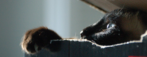
I found this great article on the web and wanted to share it with my readers.


Introduction        

 
.


This is the most important article on this website.

More important than the thousands of others, I will attempt to explain the elements that make up a great photograph.

These fundamentals are mandatory knowledge to all artists.

Photography makes it easy for anyone to create images without needing any artistic ability or training: just set AUTO and go.

You can't paint unless you study and practice. In studying painting, you are always taught image structure.

Anyone can take pictures. Formal courses of photographic study rarely, if ever, cover the basics of image structure. All they teach is technical mumbo-jumbo, which is a waste because cameras do all of the technical stuff for us today anyway.

Even professional photographers are rarely taught about the basics of image structure, which is why so many photographs are so awful.

The lack of structure is why so many photographs don't make it.

This article is critical because I hope to explain the basic structures that are so crucial to making strong images. Images that get the basics right always get people to go ooooh and ahhhhh, and those without their fundamentals in order are boring.

Armed with this information, hopefully you'll start recognizing the elements which make images that make people's jaws drop, win top honors at photo contests, and are the first images an editor picks when buying images.

Once you learn these simple basics, you'll be able to take awesome, award-winning shots with any camera. Once you can do this, you'll no longer need to waste so much money on camera gear or haul so much of it around with you. You'll just take great pictures.


The Basics       

Every image needs a basic structure. Without an underlying structure, it is just another boring photo.

Every image needs strong underlying compositional order so that it grabs the eye from a hundred feet away.

If it can't grab the eye from a distance, it will never be an interesting photo, regardless of how many fine details it might have. Details don't matter if there's no story behind it.

The reason my image above has won so many awards in so many countries and is picked continually as one of my best images is because of its strong structure.

What is this structure? It is the broad underlying colors, shapes and contrasts between light and dark upon whose structure all the other far less important details lie.

In this image, we have a big red diamond in the middle. It is surrounded by blue-gray. The big red rectangle is the obvious, positive space. The blue-gray around it is called negative space.

Red jumps out at you, especially when put in front of blue. Red does that.

I used an ultra-wide lens. Ultra-wide lenses get darker in the corners, an effect called falloff. This makes the center relatively brighter, adding emphasis. This central emphasis, in addition to being red, is what grabs your eye and pulls you in from a mile away.

This is what makes this shot a winner. Nothing else matters much compared to the way the big red diamond grabs you.

Only after its caught your eye does anything else matter.

This is crucial: if this image didn't catch your eye like this, it wouldn't mean much.

Once a photo has caught your attention, it needs to have details to keep the eyes interested. This is easy. Every photo has details. The problem is how few photos have any sort of underlying structure to catch your eye in the first place.

In this case, the less important details are the yellow peeking out from behind the red, the clouds swooping out from the center, the crud on the concrete at your feet and the reinforcing mesh seen peeking out of the top of the red wall, at least when printed at gallery size.

This photo, like all good photos, is about shapes, colors and balances. It has nothing to do with the fact that the actual subject was an abandoned, burnt-out bathhouse with no roof.

It's nice that I shot this on 4x5" film so that viewers can see every detail on every dead bug on every paint chip on the ground, but if the strong structure didn't grab the eyes in the first place, the viewer would just move on to the next image on the wall of the gallery.

Most photographers snap photos, paying attention only to the details, but ignoring the far, far more important fundamentals. Most photographers don't even know that there are fundamentals!

These fundamentals are the largest, obvious elements of light and dark, colors and shapes.

You have to get this underlying structure right, otherwise the photograph has no basis on which to stand.

If I had made this shot in black-and-white, there would be little to no contrast between the red wall and the blue. The blue is often lighter than the red in this photo, so even using a red filter in B&W would not have gotten me what I needed to catch your eye. In color, the color red takes charge and makes this shot successful.

You should be able to defocus your eyes and look at your image from a hundred feet away, and the basic organization of elements within your frame should still be obvious.

If your image goes away as a thumbnail-sized image, it has no structure. It sucks. If it doesn't jump out at you as a thumbnail, you've made a boring image, regardless of how big or detailed you print it.

The shot above still grabs people, even as a thumbnail. As a thumbnail, people want to click it and see what's going on. It's not just another gray square.

If it doesn't sing as a thumbnail, no amount of Photoshop, HDR or gigapan stitching will give it any more structure. It will still suck as hard, no matter how much time you waste on your computer. You have to get it right in your camera.

The one thing you can do later is to burn and dodge. This means lightening and darkening different parts of the image to emphasize what's important, and deemphasize what's not.

Photographs without the basics are boring. An image, be it a photograph, painting, sketch or gigapan, is meaningless unless its basics are right.

The reason so many photos are so bad is because there is no underlying structure. Bad photos may be loaded with details, but forget to get the big, broad basics of composition, light and color correct.

Sadly, most photographers are blind to the basics, and only by chance when the basics come together do they get a good shot.

More sadly, since so few photographers are paying any attention to the basics, even when they do get a good shot, they don't know why it looks good, so they can't reproduce it.

When you learn to look for the basics first, and can get the basics of composition down, you'll be able to shoot anything, anywhere, with any sort of cell-phone camera, and walk away with the images everyone else covets.

People who are blind to the basics are the great majority of people who keep throwing more money at more cameras, and never get any better pictures.

It's the basic underlying composition that makes or breaks an image.


It's not about the subject

Here's another secret: in photographic art, it's never about the subject.

It's always about the underlying compositional structure. Subjects that may be there are chosen because they support or create a structure, not the other way around.

What a subject does in real life is irrelevant. In a good photo, subjects are chosen to provide the shapes or colors we want to lay down the basic design of an image.

What might look like a door is really only used because it's a rectangle, or two squares. If we shoot it at an angle, now it's a trapezoid, or a truncated triangle.

An ocean liner? If you use the whole thing in a successful photo, its because it's used as a shape that works with whatever else is in the frame.

This is why I'm known as a toilet photographer. I don't care what my subject might be in real life. When I look for photos, I'm looking for shapes and colors. It just tends to happen that bathrooms and garbage cans tend to get lit up in great light at the end of the day, so if they're in good light, I shoot them.

The actual subject is meaningless because you're mind's subconscious eye can't even recognize it from a hundred feet away.

Your photograph must have a strong enough structure so that structure is obvious to the subconscious That's how you grab people to get the ooohs and aaahs.

The actual subject doesn't matter. Your choice of a subject should be made to give a strong underlying design to the image. What that subject is or does consciously is irrelevant. As far as photographers are concerned, photos subjects are used purely as big colors and shapes, exactly as you'd cut these colors and shapes out of construction paper to make a composition.


Composition

When composing, ignore details.

Be sure to exclude everything not directly contributing to the image.

As you compose, only look at the boldest, broadest and most basic lines and shapes in your image in the most overall and general sort of way.

I often look away from my finder to see the finder out of the corner of my eye. This lets my brain ignore details and what the conscious subject might be, and hopefully see the image's far more important underlying structure more clearly.

The only thing that matters are the bold, broad strokes. It's a photograph, not a painting, so duh, the details will take care of themselves.

The broad strokes won't. You, and you alone, have to force them exactly where you want them before you take the picture.

Nothing in an image is what it seems. Even though viewers might say "that thing in the corner is a rain boot," when composing, it's a yellow shape you are using for no reason other than as a color blob in your image.

When composing, forget the subject. You are using every item in the image as a compositional element, exactly as you'd arrange pieces of cut-out construction paper to make an interesting composition.

Move the camera forward or back to fit your elements as you want them.

Move left or right, and especially use the forgotten dimension of moving up and down, to re-arrange items in your frame as you want them.

See also Composition.

Only when you get these basics right does anything else below matter.


Eye Path

Our eyes are first attracted to the brightest, or the contrastiest, or the most colorful part of an image.

After we've caught the eye, the eye starts to wander around and see what else there is to see.

After you've caught a viewer's eye, you have to be sure that it stays in your image, and doesn't wander out.

Keep details out of the corners, and be sure that important elements aren't cut by the frame edges. How do we move mountains? Easy: turn the camera, or walk a few steps left or right to move them relative to the tree in your frame.

This is one of the may reasons why HDR and other stitching and stacking hobbies are so bad. You need to spend you time looking for the best position from which to make a shot. Never spend 20 minutes making multiple exposures unless you spent at least twice that much time looking for the best point of view.

By keeping corners dark, it keeps our eyes from wandering off the edges. By keeping details out of the corners, it also keeps our eyes from leaving the frame.

Look at any real painting, even motel art. You'll see that even motel artists know not to run details off the edge of the frame. Look at nature paintings, and you'll usually see that the leaves on the pond magically are aligned so that none of them are cut by the edge of the image. It's the same for trees and rocks: it's not by chance that they usually are painted in such a way that they don't cross the image's edge.

We who read English usually start at the top left, and work our way to the bottom right. At the very least, we read an image from left to right. It's weird if a car is driving to the left; that's backwards.

Our eyes last look into the dark areas. They only get there if the image was good enough catch our eye in the first place, then had enough lighter details to keep us looking around for a while, and be good enough that we're still curious enough to see what is in the shadows.

Anther reason HDR sucks so bad is because it eliminates light and dark. An all-gray, all-busy image has no structure, and is boring.


Burning and Dodging

The most important image editing, other than cropping, is selective lightening and darkening, called dodging and burning.

Lighten the parts of the image to which you want to add emphasis, and to which you want to attract the eye first.

Darken the parts of the image that are irrelevant, or lead the eyes away from the important part.

How do we keep the corners dark to keep eyes from wandering off? Both by composing the image that way, and by darkening the print edges later in the darkroom. Ansel Adams called this important technique "edge burning."

Always be subtle in your burning and dodging. The instant it becomes obvious that you've used it, the photo is trash. The effect is the strongest when you keep it subtle enough to stay in the subconscious.

I usually use about half the strength of what I first think I want to use when burning and dodging. Otherwise, if it becomes obvious, and destroys the effect.


Distractions

When the USA invaded Iraq again in 2003, President George Bush was deadly clear: you're either on our side and doing your part to support the coalition's annexation of Iraq, or you are the enemy. In other words, there are no neutral parties. If a country feels like it can ignore helping the coalition and stay out of it, it has just made itself an enemy of the United States.

Photographs are the same way. Anything that isn't directly helping the composition takes away from it. It's just like editing: the fewer words you use, the better the writing.

Details that don't add to the overall structure of the image make it weaker. See the annoying tree in the sky on the left? I has nothing to do with the rest of the image. I always crop that out, otherwise, viewer's eyes keep going back to it, which pulls eyes off the image. It is a distraction, which makes for a poorer image.

If you aren't seeing how much worse the image is with the tree silhouette in it, cover the left side of the image to remove it, and it gets twice as strong.


Punchline

The best images have a punchline.

Who wants to hear a joke or see a movie without a good ending?

A punchline is what you find after you look around the image.

A punchline doesn't have to be hidden. A punchline can be as simple as a row of soldiers, and one at the end is doing or wearing something different.


Double Punchlines

Everyone has set up their camera in front of a colorful doorway and waited for someone interesting to walk by.

Every hobbyist has nice photos of street scenes with a cleverly placed person or cart whizzing by.

So what? That's a minor punchline.

A single punchline is something simple, like a photo of a train window, and the last one has someone looking out. Big deal.

A double punchline is when you have something in the photo reacting to something else in the photo.

For instance, a master like Jay Maisel has photos where you have a train window with an obligatory punchline of a person looking out one window, but then you'll notice someone in the next car looking back in surprised response to the first person!


Gesture

Gesture means the position of hands. In an image, gesture can also mean what is said by the positions of inanimate objects that mimic our hands or faces.

Gesture means a photo with someone making a funny face in reaction to something else going on in the frame. For instance, a good photo is one where you first notice something odd, and then you notice someone else in the photo reacting to it. That's both paying attention to gesture, and gives us a punchline.

Gesture applies to inanimate objects. You can find arrangements of things that suggest the same things that can be expressed facially and with hands.

Animators know how positions of hands and eyebrows can say everything. If you find compositional elements which mimic these, your photos can express the same emotions.

Most of the time, gesture refers to facial and hand expressions.


Color

Books have been written about color. Go to your library, or an art library, and read them. I'll only touch the basics here. I have another page about color.

Warm colors, red, orange and yellow, appear to move forward towards the viewer. Our eyes are attracted to them first.

Cool colors, greens, blues and violets, recede away from the viewer.

An easy way to make your image three-dimensional is to have an orange object in front of a blue background. Movies do this all the time.

Put orange on blue, and in comes forward.

Put a red building on blue as I did, and the red comes out and hits you.

Colors need to be in harmony. There are a zillion ways to analyze this, but as a photographer you have it easy. What looks good is good. Painters have it harder, since they need to design and synthesize their colors from their own imaginations.

Colors tend to be harmonious when you have two colors balanced from opposite sides of the color wheel. You can get fancy and have two variations of a similar color balancing another opposing color. You can try to have three colors, all equally spaced on the color wheel.

I'm simple: I like brilliant orange, as lit by the late afternoon sun, highlighted against the dark blue of a sky.

Warm colors get us riled up.

Cool colors are peaceful.

Follow your own eyes, and read lots of books if you want to know the formal analyses.

If you shoot color, you must pay attention to color. You can't just shoot in color and expect the colors to come out magically wonderful. You have to look for them.

Artists look at my work and realize the subject is the colors themselves.

If color doesn't add to your image, don't shoot color. Shoot black-and-white.

Don't shoot color because it's what your camera does at default. If you aren't actively going to be sensitive to colors, don't shoot them.


Lighting

Lighting is the most important technical issue in photography. Pro photographers pay close attention to it, while hobbyists sadly ignore it.

For our purposes here, lighting is the biggest contributor to light and dark, to colors, and to shapes and lines.

The direction of light and shadow defines our lines and shapes.

Lines, colors, shapes, light and dark are 99% of our image. Lighting is everything.


Close One Eye

Life is three-dimensional. Not only is it three-dimensional, it has sounds, smells and a whole lot more.

It is extremely difficult to package a life experience into a flat, rectangular print.

I love photographing around trees and nature, except there is a huge gotcha: the reason we like to shoot around them is because of the 3D effect, but since our photos are flat, we can't capture that.

When shooting, always remember close one eye as you view any potential scene.

Close one eye, and suddenly a scene, alive with trees, bushes, rocks and nature, collapses into a boring mass of crap. This is how your photo will look, at best.

Don't move as you look through one eye. If you do this while walking, your brain will still figure it out and piece it back together as 3D.

Stop, hold still, close one eye, hold out your hands to make a rectangle, and that's, at best, how your photo might look.

Pretty boring, eh? Sorry to rain on your parade, but this is another reason most people's nature shots look so bad.

What looked great to their stereo vision wasn't composed with any compositional elements that could lead to an interesting image. Once the 3D effect is removed, it collapses to the random jumble of garbage it is.

If you remember to view through one fixed eye, you can train yourself to pass on images that won't work as flat photographs, and learn to find subjects that will work as strong images.

This is important: by skipping what you now know will look awful, you'll start getting a much higher percentage of keepers. As time progresses, you'll get better at recognizing what makes a keeper, and start turning out a lot more good work.

When nature looks dull when seen with one eye, start arranging your composition to say something. When you can do this, you are becoming a photographer.


Never Imitate

No one can be as good at being Ansel Adams or Jack Dykinga or Jay Maisel or David Muench or Richard Avedon or whoever, as they were.

Don't even try.

Only you can be you. None of them can ever be as good at being you as you are.

The biggest difference between them and you or I is that they got over worrying about technique, and put all their efforts into looking for good images. David Muench doesn't even look for images, he just goes out with no preconceived notions and goes wherever he feels like he's being guided. Muench pays most of his attention to picking up on whatever signals he's picking up from the landscape. They all go out with open minds and see what they see.

Leading photographers never go out with navigational coordinates attempting to find the same location some other shooter used before.

Screw convention. It's the fastest way to boring images. Don't ever try to shoot anything based on what you think might play well in a contest or might be something other people might like.

Follow your own passion and excitement. Shoot what excites you. If you can capture your own excitement, you just got a good image.

Think about this: if the guy who made the shot you admire didn't start out with a GPS map printout, how on Earth do you expect to do any better yourself when you get there in different conditions? The guys who shoot nature know the light and conditions are far more important than the location. If they do find a location they like, they may have to wait years to get the right light there.

Don't expect that on your two weeks of vacation that you can drive up to the same spot and duplicate years of waiting effort. The way these guys find their pictures is by keeping their eyes on what's in front of them, not a map. When magnificent conditions hit they shoot what's in front of them at the time.


You Can't Go Back

When the conditions are right, shoot.

As you learn to be more observant, the more you'll realize how nothing stays the same, even for a minute.

Lighting changes, and cars pull up in front of your subjects. People sit down in front of you, or they leave.

If you have to fiddle with a tripod, you're dead.

Shoot today. Shoot NOW. You can't go back next week.

The light will never be the same.

The building might not be there.

The shot at the top of the page?

It got repainted the next day. Those colors will never be there again.

No big deal: just keep your eyes open and there are newer, better things to shoot all the time.


FARTing

Be sure to FART before each picture.


Summary

If you can learn to get the basic compositional structure of your images right, you will be making much better images than most photographers ever do.

Most photographers just point and shoot, and hope something turns out. Regardless of how advanced their equipment and how exotic the location, failing to pay attention to the basic design elements results in ho-hum pictures, no more than thoughtless snapshots.

By paying rapt attention to the underlying shapes and forms which make up your image, your images will stand above the rest.

Photos always have details. The camera does that.

The camera can't compose the basics of your image. You, and you alone, have to do that.

If you get the basics right, you will make great images with any camera.

If you don't pay attention, you'll get crummy images with every camera, which is why most beginners keep throwing more money at more cameras, and get the same results.

I pay a lot of attention to my camera's position. Even fractions of an inch (millimeters) can make or break a photograph.

You can't do any of this after you've snapped your photo.

If you want to try HDR or other silly stacking or stitching shenanigans, be very sure that you are already enough of a master to know exactly where and when to plop down your tripod, since if you don't get that right, nothing will be any good.


Thanks for reading!